⨳ the vertical app listing ⨳
2010 Feb 15, Monday
⨳ 2 minute read ⨳ 415 words ⨳ iOS ⨳or how apple can fix the iPhone OS home screen mess
the iPhone OS home screen is broke.
it does not match the default set of apps; specifically mail.app, iPod.app, notes.app, and contacts.app. in each of these apps, scrolling is done vertically, not horizontally. there are no “pages” to slide between, the listing of apps flows top to bottom.
pages as an organization tool. you probably like the idea of blank space as an organization tool. i just so happens that the only blank space users can currently use are new pages. to switch to the app listing approach, apple would need to make 2 fillers available: one that fills a partial row horizontally, and another that adds a complete blank row.
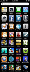
pages as an artificial limitation. pages limit the number of apps displayed on your device. iphone os 3.1.3 has an 11 page limit where only 180 apps can be displayed (16 apps per page * 11 pages of apps + 4 apps in the dock). really? a scrolling listing would not have such artificial limits. iTunes.app, for example, doesn’t limit the song list to 180 songs, so why should the system? Apple got around this barrier by adding spotlight search: search for your hidden app, then you can run it.
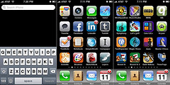
spotlight search. the traditional search feature is accessed by pulling down on the app listing while at the top of a listing. contacts, songs, notes, etc. can be searched. many third-party apps have followed this approach for searching content within the app.
get home quick. what about getting back to the top of the app listing? simply tap the title bar or a single press of the home button will zip users up to the top where they can pull down spotlight search.
what becomes of the dock. simply put, the dock becomes obsolete. users can place their frequently-accessed apps at the the top of the list. suddenly, users can see up to 20 different apps at once, not 16 + 4 constant.
landscape orientation. with the dock banished, nothing would prevent the apps from ‘re-flowing’ between portrait and landscape modes. still 20 different apps, but now it’d be 5x4 rather than 4x5. the settings.app would have an option to set default orientation and an option to prevent switching. remember the two fillers that apple would make? they’d hold their listing position.
demo time. which is easier? more elegant? more mac-like?